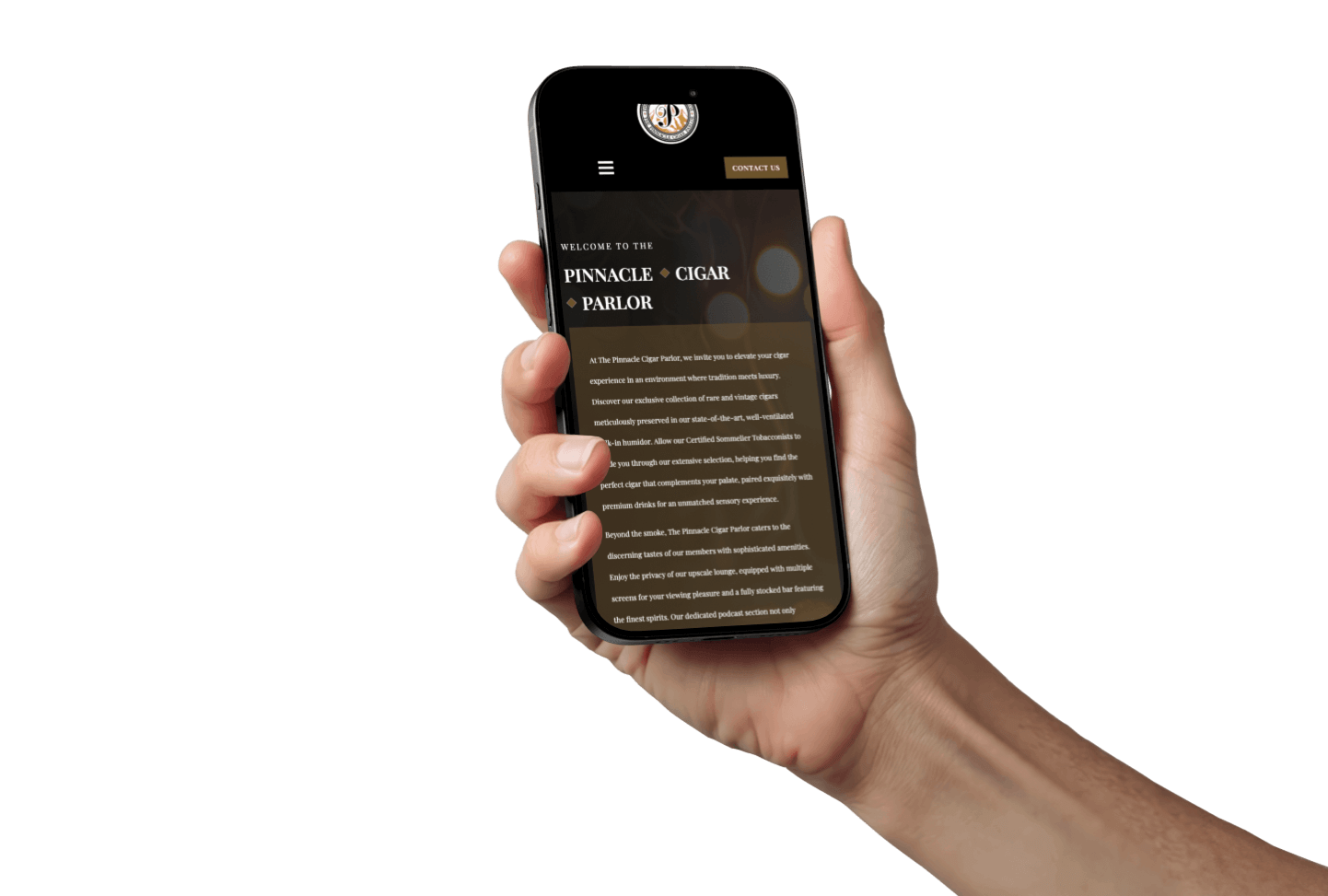
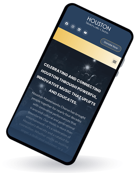 In today’s on-the-go, screen-switching world, responsive website design for small business Houston isn’t a nice-to-have—it’s a competitive weapon. When your site senses each visitor’s device and delivers a perfectly tailored experience, you stop guessing and start converting: more leads, more calls, more revenue.
Smart Tech Under the Hood
Forget separate “mobile” and “desktop” sites. True responsive design uses:
- CSS Media Queries to detect screen size
- Fluid Grids that stretch or shrink content
- Flexible Images that load the right resolution
All powered by one codebase. Your site automatically reshuffles layout, swaps in optimized media, and fine-tunes typography—no plugins, no extra downloads, no messy maintenance.
“It’s like having a chameleon for a website: blending perfectly wherever it lands.”
From Device Awareness to Dollar Signs
When you know your visitor’s screen and input method, you can:
- Serve Crisp Readability. No tiny text, no awkward zooming.
- Load Only What Matters. Faster loads keep impatient users engaged.
- Offer Tappable CTAs. One-tap “Get My Free Growth Roadmap” and click-to-call buttons turn visits into action.
That seamless UX slashes bounce rates, boosts session time, and turbocharges conversions.
Why Search Engines Cheer You On
Google’s mobile-first indexing means it crawls your mobile view before anything else. Here’s why responsive wins every time:
- Speed = Rankings. Better Core Web Vitals vault you up local SERPs.
- Unified SEO Power. One URL, one HTML—no fragmenting backlinks across “m.” domains.
- Less Headache. One site to update, one source of truth for content, schema, and link equity.
The Design & Dev Craftmanship
Crafting a rock-solid responsive site isn’t copy-paste work. It demands:
- Breakpoint Mastery. We map layouts for smartphones, tablets, laptops, even giant 4K screens.
- Art-Directed Components. Images, buttons, and hero sections designed to look intentional—never “auto-scaled.”
- QA Rigor. Real-device testing (iOS, Android, Windows), emulator checks, performance profiling.
- Future-Proof Maintenance. New phones drop monthly; updates and regression tests keep you sharp.
Mobile Funnel: Your Growth Highway
- Discovery: Prospects search “Houston boutique café” on their phones.
- Engagement: They swipe through hero carousels and digest bite-sized copy.
- Action: Streamlined forms and one-tap calls capture the lead.
- Delight: Fast, polished experiences build trust, spark referrals, and fuel repeat business.
A single broken button or misplaced image? That’s a pothole in your growth highway—one you can’t afford.
Four Responsive Features That Pay Off
- Sticky “Get My Free Growth Roadmap” Bars keep your offer visible, even in long articles.
- Click-to-Call Buttons transform casual browsers into immediate phone leads.
- Adaptive Carousels showcase portfolios without dragging load times.
- Dynamic Content Reordering surfaces your most persuasive points first on small screens.
Real-World Data: Houston Benchmarks
| Sector | Avg. Mobile Conv. Rate | Responsive Uplift |
|---|---|---|
| Retail | 1.8 % | 2.6 % (+45 %) |
| Services | 2.2 % | 4.4 % (+100 %) |
| B2B | 1.5 % | 2.3 % (+53 %) |

Mobile conversion uplift by sector after responsive design.
Case Study: Midtown Café saw a 40 % sales surge simply by making its online menu mobile-friendly—and adding sticky order buttons.
Your Step-by-Step Responsive Roadmap
- Audit & Plan:
- Run Chrome DevTools audits
- Sketch device-specific wireframes
- Prototype & Test:
- Deploy on real iOS/Android devices
- Solicit beta feedback from actual users
- Build & Launch:
- Code in clean, modular CSS/JS
- Monitor GA4 mobile metrics + Hotjar heatmaps
- Optimize Continually:
- A/B test mobile CTAs in Google Optimize
- Refine based on session recordings and drop-off analyses
IMPROZ in Action: Search-Everywhere + Responsive
At IMPROZ Marketing, we marry our Search-Everywhere philosophy with elite responsive design:
- Holistic SEO: One site, one strategy that adapts across devices.
- Cross-Channel Harmony: From Google to Instagram, your responsive site anchors every campaign.
- Data-Driven Iteration: We track real-time performance and continuously fine-tune for growth.
Ready to Dominate Houston’s Mobile Market?
Don’t let a clunky site derail your growth.
- Take me to IMPROZ web design services to know more about it all.
- and see exactly how IMPROZ turns responsive design into skyrocketing leads.
Responsive website design for small business Houston isn’t just tech—it’s the launchpad for unstoppable growth.